Chapter 19
Other Useful Kinds of Regression
IN THIS CHAPTER
 Using Poisson regression to analyze counts and event rates
Getting a grip on nonlinear regression
Smoothing data without making any assumptions
This chapter covers regression approaches you’re likely to encounter in biostatistical work that are not covered in other chapters. They’re not quite as common as straight-line regression, multiple regression, and logistic regression (described in Chapters 16, 17, and 18, respectively), but you should be aware of them. We don’t go into a lot of detail, but we describe what they are, the circumstances under which you may want to use them, how to execute the models and interpret the output, and special situations you may encounter with these models.
Note: We also don’t cover survival regression in this chapter, even though it’s one of the most important kinds of regression analysis in biostatistics. Survival analysis is the theme of Part 6 of this book, and is the topic of Chapter 23.
Analyzing Counts and Rates with Poisson Regression
Statisticians often have to analyze outcomes consisting of the number of occurrences of an event over some interval of time, such as the number of fatal highway accidents in a city in a year. If the occurrences seem to be getting more common as time goes on, you may want to perform a regression analysis to see whether the upward trend is statistically significant (meaning not due to natural random fluctuations). If it is, you may want to create an estimate of the annual rate of increase, including a standard error (SE) and confidence interval (CI).
Some analysts use ordinary least-squares regression as described in Chapter 16 on such data, but event counts don’t really meet the least-squares assumptions, so the approach is not technically correct. Event counts aren’t well-approximated as continuous, normally-distributed data unless the counts are very large. Also, their variability is neither constant nor proportional to the counts themselves. So straight-line or multiple least-squares regression is not the best choice for event count data.
Because independent random events like highway accidents should follow a Poisson distribution (see Chapter 24), they should be analyzed by a kind of regression designed for Poisson outcomes. And — surprise, surprise — this type of specialized regression is called Poisson regression.
Introducing the generalized linear model
Most statistical software packages don’t offer a command or function explicitly called Poisson regression. Instead, they offer a more general regression technique called the generalized linear model (GLM).
 Don’t confuse the generalized linear model with the very similarly named general linear model. It’s unfortunate that these two names are almost identical, because they describe two very different things. Now, the general linear model is usually abbreviated LM, and the generalized linear model is abbreviated GLM, so we will use those abbreviations. (However, some old textbooks from the 1970s may use GLM to mean LM, because the generalized linear model had not been invented yet.)
GLM is similar to LM in that the predictor variables usually appear in the model as the familiar linear combination:

where the x’s are the predictor variables, and the c’s are the regression coefficients (with  being called a constant term, or intercept).
But GLM extends the capabilities of LM in two important ways:
- With LM, the outcome is assumed to be a continuous, normally distributed variable. But with GLM, the outcome can be continuous or an integer. It can follow one of several different distribution functions, such as normal, exponential, binomial (as in logistic regression), or Poisson.
- With LM, the linear combination becomes the predicted value of the outcome, but with GLM, you can specify a link function. The link function is a transformation that turns the linear combination into the predicted value. As we note in Chapter 18, logistic regression applies exactly this kind of transformation: Let’s call the linear combination V. In logistic regression, V is sent through the logistic function
 to convert it into a predicted probability of having the outcome event. So if you select the correct link function, you can use GLM to perform logistic regression.
 GLM is the Swiss army knife of regression. If you select the correct link function, you can use it to do ordinary least-squares regression, logistic regression, Poisson regression, and a whole lot more. Most statistical software offers a GLM function; that way, other specialized regressions don’t need to be programmed. If the software you are using doesn’t offer logistic or Poisson regression, check to see whether it offers GLM, and if it does, use that instead. (Flip to Chapter 4 for an introduction to statistical software.)
Running a Poisson regression
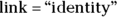
Suppose that you want to study the number of fatal highway accidents per year in a city. Table 19-1 shows some made-up fatal-accident data over the course of 12 years. Figure 19-1 shows a graph of this data, created using the R statistical software package.
Running a Poisson regression is similar in many ways to running the other common kinds of regression, but there are some differences. Here are the steps:
As with any regression, prepare your predictor and outcome variables in your data.
For this example, you have a row of data for each year, so year is the experimental unit. For each row, you have a column containing the outcome values, which is number of accidents each year (Accidents). Since you have one predictor — which is year — you have a column for Year.
- Tell the software which variables are the predictor variables, and which one is the outcome.
Tell the software what kind of regression you want it to carry out by specifying the family of the dependent variable’s distribution and the link function.
Step 3 is not obvious, and you may have to consult your software’s help file. In the R program, as an example, you have to specify both family and link in a single construction, which looks like this:

This code tells R that the outcome is the variable Accidents, the predictor is the variable Year, and the outcome variable follows the Poisson family of distributions. The code
 tells R that you want to fit a model in which the true event rate rises in a linear fashion, meaning that it increases by a constant amount each year.
Execute the regression and obtain the output.
The next step is to interpret the output.
TABLE 19-1 Yearly Data on Fatal Highway Accidents in One City
Calendar Year |
Fatal Accidents |
|---|---|
2010 |
10 |
2011 |
12 |
2012 |
15 |
2013 |
8 |
2014 |
8 |
2015 |
15 |
2016 |
4 |
2017 |
20 |
2018 |
20 |
2019 |
17 |
2020 |
29 |
2021 |
28 |

© John Wiley & Sons, Inc.
FIGURE 19-1: Yearly data on fatal highway accidents in one city.
Interpreting the Poisson regression output
After you follow the steps for running a Poisson regression in the preceding section, the program produces output like that shown in Figure 19-2, which is the Poisson regression output from R’s generalized linear model function (glm).

FIGURE 19-2: Poisson regression output.
This output has the same general structure as the output from other kinds of regression. The most important parts of it are the following:
- In the coefficients table (labeled Coefficients:), the estimated regression coefficient for Year is 1.3298, indicating that the annual number of fatal accidents is increasing by an estimated 1.33 accidents per year.
- The standard error (SE) is labeled Std. Error and is 0.3169, indicating the precision of the estimated rate increase per year. From the SE, using the rules given in Chapter 10, the 95 percent confidence interval (CI) around the estimated annual increase is approximately
 , which gives a 95 percent CI of 0.71 to 1.95 (around the estimate 1.33).
 - The column labeled z value contains the value of the regression coefficient divided by its SE. It’s used to calculate the p value that appears in the last column of the table.
- The last column, labeled
 , is the p value for the significance of the increasing trend estimated at 1.33. The Year variable has a p value of 2.71 e-05, which is scientific notation (see Chapter 2) for 0.0000271. Using α = 0.05, the apparent increase in rate over the 12 years would be interpreted as highly statistically significant.
 - AIC (Akaike’s Information Criterion) indicates how well this model fits the data. The value of 81.72 isn’t useful by itself, but it’s very useful when choosing between two alternative models, as we explain later in this chapter.
R software can also provide the predicted annual event rate for each year, from which you can add a trend line to the scatter graph, indicating how you think the true event rate may vary with time (see Figure 19-3).
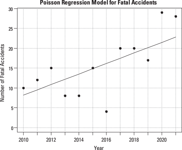
© John Wiley & Sons, Inc.
FIGURE 19-3: Poisson regression, assuming a constant increase in accident rate per year with trend line.
Discovering other uses for Poisson regression
The following sections describe other uses of R’s GLM function in performing Poisson regression.
Examining nonlinear trends
The straight line in Figure 19-3 doesn’t account for the fact that the accident rate remained low for the first few years and then started to climb rapidly after 2016. Perhaps the true trend isn’t a straight line, where the rate increases by the same amount each year. It may instead be an exponential increase, where the rate increases by a certain percentage each year. You can have R fit an exponential increase by changing the link option from identity to log in the statement that invokes the Poisson regression:
glm(formula = Accidents ~ Year, family = poisson(link = “log”))
This produces the output shown in Figure 19-4 and graphed in Figure 19-5.

FIGURE 19-4: Output from an exponential trend Poisson regression.
Because of the log link used in this regression run, the coefficients are related to the logarithm of the event rate. Thus, the relative rate of increase per year is obtained by taking the antilog of the regression coefficient for Year. This is done by raising e (the mathematical constant 2.718…) to the power of the regression coefficient for Year:  , which is about 1.11. So, according to an exponential increase model, the annual accident rate increases by a factor of 1.11 each year — meaning there is an 11 percent increase each year. The dashed-line curve in Figure 19-4 shows this exponential trend, which appears to accommodate the steeper rate of increase seen after 2016.
Comparing alternative models
The bottom of Figure 19-4 shows the AIC value for the exponential trend model is 78.476, which is about 3.2 units lower than for the linear trend model in Figure 19-2 ( ). Smaller AIC values indicate better fit, so the true trend is more likely to be exponential rather than linear. But you can’t conclude that the model with the lower AIC is really better unless the AIC is about six units better. So in this example, you can’t say for sure whether the trend is linear or exponential, or potentially another distribution. But the exponential curve does seem to predict the high accident rates seen in 2020 and 2021 better than the linear trend model.
© John Wiley & Sons, Inc.
FIGURE 19-5: Linear and exponential trends fitted to accident data.
Working with unequal observation intervals
In this fatal accident example, each of the 12 data points represents the accidents observed during a one-year interval. But imagine analyzing the frequency of emergency department visits for patients after being treated for emphysema, where there is one data point per patient. In that case, the width of the observation interval may vary from one individual in the data to another. GLM lets you provide an interval width along with the event count for each individual in the data. For arcane reasons, many statistical programs refer to this interval-width variable as the offset.
Accommodating clustered events
The Poisson distribution applies when the observed events are all independent occurrences. But this assumption isn’t met if events occur in clusters. Suppose you count individual highway fatalities instead of fatal highway accidents. In that case, the Poisson distribution doesn’t apply, because one fatal accident may kill several people. This is what is meant by clustered events.
 The standard deviation (SD) of a Poisson distribution is equal to the square root of the mean of the distribution. But if clustering is present, the SD of the data is larger than the square root of the mean. This situation is called overdispersion. GLM in R can correct for overdispersion if you designate the distribution family quasipoisson rather than poisson, like this:
glm(formula = Accidents ~ Year, family = quasipoisson(link = “log”))
Anything Goes with Nonlinear Regression
Here, we finally present the potentially most challenging type of least-squares regression, and that’s general nonlinear least-squares regression, or nonlinear curve-fitting. In the following sections, we explain how nonlinear regression is different from other kinds of regression. We also describe how to run and interpret a nonlinear regression using an example from drug research, and we show you some tips involving equivalent functions.
Distinguishing nonlinear regression from other kinds
In the kinds of regression we describe earlier in this chapter and in Chapters 16, 17, and 18, the predictor variables and regression coefficients always appear in the model as a linear combination:  . But in nonlinear regression, the coefficients no longer have to appear paired up to be multiplied by predictor variables (like
  ). In nonlinear regression, coefficients have a more independent existence, and can appear on their own anywhere in the formula. Actually, the term coefficient implies a number that’s multiplied by a variable’s value. This means that technically, you can’t have a coefficient that isn’t multiplied by a variable, so when this happens in nonlinear regression, they’re referred to instead as parameters.
The formula for a nonlinear regression model may be any algebraic expression. It can involve sums, differences, products, ratios, powers, and roots. These can be combined together in a formula with logarithmic, exponential, trigonometric, and other advanced mathematical functions (see Chapter 2 for an introduction to these items). The formula can contain any number of predictor variables, and any number of parameters. In fact, nonlinear regression formulas often contain many more parameters than predictor variables.
Unlike other types of regression covered in this chapter and book, where a regression command and code are used to generate output, developing a full-blown nonlinear regression model is more of a do-it-yourself proposition. First, you have to decide what function you want to fit to your data, making this choice from the infinite number of possible functions you could select. Sometimes the general form of the function is determined or suggested by a scientific theory. Using a theory to guide your development of a nonlinear function means relying on a theoretical or mechanistic function, which is more common in the physical sciences than life sciences. If you choose your nonlinear function based on a function with a generally similar shape, you are using an empirical function. After choosing the function, you have to provide starting estimates for the value of each of the parameters appearing in the function. After that, you can execute the regression. The software tries to refine your estimates using an iterative process that may or may not converge to an answer, depending on the complexity of the function you’re fitting and how close your initial estimates are to the truth. And in addition to attending to these unique issues, analysts running a nonlinear regression face all the other complications of multivariate regression, such as collinearity, as described in Chapter 17.
Checking out an example from drug research
One common nonlinear regression problem arises in drug development research. As soon as scientists start testing a promising new compound, they want to determine some of its basic pharmacokinetic (PK) properties. PK properties describe how the drug is absorbed, distributed, modified, and eliminated by the body. Typically, the earliest Phase I clinical trials attempt to obtain basic PK data as a secondary objective of the trial, while later-phase trials may be designed specifically to characterize the PKs of the drug accurately and in great detail.
Raw PK data often consist of the concentration level of the drug in the participant’s blood at various times after a dose of the drug is administered. Consider a Phase I trial, in which 10,000 micrograms (μg) of a new drug is given as a single bolus, which is a rapid injection into a vein, in each participant. Blood samples are drawn at predetermined times after dosing and are analyzed for drug concentrations. Hypothetical data from one participant are shown in Table 19-2 and graphed in Figure 19-6. The drug concentration in the blood is expressed in units of μg per deciliter ( ). Remember, a deciliter is one-tenth of a liter.
Several basic PK parameters, such as maximum concentration, time of maximum concentration, area under the curve (AUC), are usually calculated directly from the concentration-versus-time data, without having to fit any curve to the points. But two important parameters are usually obtained from a regression analysis:
- The volume of distribution (
 ): This is the effective volume of fluid or tissue through which the drug is distributed in the body. This effective volume could be equal to the blood volume, but could be greater if the drug also spreads through fatty tissue or other parts of the body. If you know the dose of the drug infused (Dose), and you know the blood plasma concentration at the moment of infusion (
 ), you can calculate the volume of distribution as
  . But you can’t directly measure
  . By the time the drug has distributed evenly throughout the bloodstream, some of it has already been eliminated from the body. So
  has to be estimated by extrapolating the measured concentrations backward in time to the moment of infusion (
 ).
). - The elimination half-life (λ): The time it takes for half of the drug in the body to be eliminated.
TABLE 19-2 Blood Drug Concentration versus Time for One Participant
Time after Dosing (In Hours) |
Drug Concentration in Blood (μg/dL) |
|---|---|
0.25 |
57.4 |
0.5 |
54.0 |
1 |
44.8 |
1.5 |
52.7 |
2 |
43.6 |
3 |
40.1 |
4 |
27.9 |
6 |
20.6 |
8 |
15.0 |
12 |
10.0 |

© John Wiley & Sons, Inc.
FIGURE 19-6: The blood concentration of an intravenous drug decreases over time in one participant.
PK theory is well-developed and predicts under a set of reasonable assumptions that the drug concentration (Conc) in the blood following a bolus infusion should vary with time (Time) according to the equation:
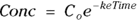
where  is the elimination rate constant.
 is related to the elimination half-life (λ) according to the formula:
  , where 0.693 is the natural logarithm of 2. So, if you can fit the preceding equation to your Conc-versus-Time data in Table 19-2, you can estimate
  , from which you can calculate
  . You can also estimate
  , from which you can calculate λ.
The preceding equation is nonlinear and includes parameters, with appearing in the exponent. Before nonlinear regression software became widely available, analysts would take a shortcut by shoehorning this nonlinear regression problem into a straight-line regression by working with the logarithms of the concentrations. But that approach can’t be generalized to handle more complicated equations that often arise.
Running a nonlinear regression
Nonlinear curve-fitting is supported by many modern statistics packages, like SPSS, SAS, GraphPad Prism, and R (see Chapter 4). It is possible (though not easy) to set up calculations in Microsoft Excel. In addition, the web page http://StatPages.info/nonlin.html can fit any function you can write involving up to eight independent variables and up to eight parameters. Here are the steps we use to do nonlinear regression in R:
Create a vector of time data, and a vector of concentration data.
In R, you can develop arrays called vectors from data sets, but in this example, we create each vector manually, naming them Time and Conc, using the data from Table 19-2:


In the two preceding equations, c is a built-in R function for combine that creates an array (see Chapter 2) as a vector from the lists of numbers.
Specify the equation to be fitted to the data, using the algebraic syntax your software requires.
We write the equation using R’s algebraic syntax this way: Conc ~ C0 * exp(– ke * Time), where Conc and Time are your vectors of data, and C0 and ke are parameters you set.
Tell the software that C0and keare parameters to be fitted, and provide initial estimates for these values.
Nonlinear curve-fitting is a complicated task solved by the software through iteration. This means you give it some rough estimates, and it refines them into closer estimates to the truth, repeating this process until it arrives at the best-fitting, least-squares solution.
Coming up with starting estimates for nonlinear regression problems can be tricky. It’s more of an art than a science. If the parameters have physiological meaning, you may be able to make a guess based on known physiology or past experience. Other times, your estimates have to be trial and error. To improve your estimates, you can graph your observed data in Microsoft Excel, and then superimpose a curve from values calculated from the function for various parameter guesses that you type in. That way, you can play around with the parameters until the curve is at least in the ballpark of the observed data.
In this example, C0 (variable C0) is the concentration you expect at the moment of dosing (at
 ). From Figure 19-6, it looks like the concentration starts out around 50, so you can use 50 as an initial guess for C0. The ke parameter (variable ke) affects how quickly the concentration decreases with time. Figure 19-6 indicates that the concentration seems to decrease by half about every few hours, so λ should be somewhere around 4 hours. Because
 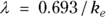 , a little algebra gives the equation ke= 0.693/X. If you plug in 4 hours for X, you get ke = 0.693/4 = 0.2, so you may try 0.2 as a starting guess for ke. You tell R the starting guesses by using the syntax: start=list(
 ,
,  ).
).
The statement in R for nonlinear regression is nls, which stands for nonlinear least-squares. The full R statement for executing this nonlinear regression model and summarizing the output is:

Interpreting the output
As complicated as nonlinear curve-fitting may be, the output is actually quite simple. It is formatted and interpreted like the output from ordinary linear regression. Figure 19-7 shows the relevant part of R’s output for this example.

FIGURE 19-7: Results of nonlinear regression in R.
In Figure 19-7, the output first restates the model being fitted. Next, what would normally be called the coefficients table is presented, only this time, it is labeled Parameters. It has a row for every adjustable parameter that appears in the function. Like other regression tables, it shows the fitted value for the parameter under Estimate, its standard error (SE) under Std. Error, and the p value under Pr(>|t|) indicating whether that parameter was statistically significantly different from zero. The output estimates at
at  μg/dL and
  at
at 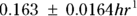 because first-order rate constants have units of per time. From these values, you can calculate the PK parameters you want:
- Volume of distribution:
 , or 16.8 liters. Since this amount is several times larger than the blood volume of the average human, the results indicate that this drug is going into other parts of the body besides the blood.
 - Elimination half-time: λ = 0.693/ke = 0.693/0.163hr1, or 4.25 hours. This result means that after 4.25 hours, only 50 percent of the original dose is left in the body. After twice as long, which is 8.5 hours, only 25 percent of the original dose remains, and so on.
How precise are these PK parameters? In other words, what is their SE? Unfortunately, uncertainty in any measured quantity will propagate through a mathematical expression that involves that quantity, and this needs to be taken into account in calculating the SE. To do this, you can use the online calculator at https://statpages.info/erpropgt.html. Choose the estimator designed for two variables, and enter the information from the output into the calculator. You can calculate that the 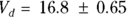 liters, and
 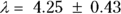 hours.
R can be asked to generate the predicted value for each data point, from which you can superimpose the fitted curve onto the observed data points, as in Figure 19-8.
R also provides the residual standard error (labeled Residual std. err. in Figure 19-7), which is defined as the standard deviation of the vertical distances of the observed points from the fitted curve. The value from the output of 3.556 means that the points scatter about 3.6 μg/dL above and below the fitted curve. Additionally, R can be asked to provide Akaike’s Information Criterion (AIC), which is useful in selecting which of several possible models best fits the data.

© John Wiley & Sons, Inc.
FIGURE 19-8: Nonlinear model fitted to drug concentration data.
Using equivalent functions to fit the parameters you really want
It’s inconvenient, annoying, and error-prone to have to perform manual calculations on the parameters you obtain from nonlinear regression output. It’s so much extra work to read the output that contains the estimates you need, like and the
  rate constant, then manually calculate the parameters you want, like
  and λ. It’s even more work to obtain the SEs. Wouldn’t it be nice if you could get
  and λ and their SEs directly from the nonlinear regression program? Well, in many cases, you can!
Because nonlinear regression involves algebra, some fancy math footwork can help you out. Very often, you can re-express the formula in an equivalent form that directly involves calculating the parameters you actually want to know. Here’s how it works for the PK example we use in the preceding sections.
Algebra tells you that because 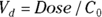 , then
 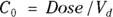 . So why not use
  instead of
  in the formula you’re fitting? If you do, it becomes
 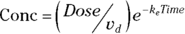 . And you can go even further than that. It turns out that a first-order exponential-decline formula can be written either as
  or as the algebraically equivalent form
  .
.
Applying both of these substitutions, you get the equivalent model: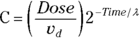 , which produces exactly the same fitted curve as the original model. But it has the tremendous advantage of giving you exactly the PK parameters you want, which are
  and λ, rather than
  and ke which require post-processing with additional calculations.
From the original description of this example, you already know that Dose = 10,000 μg, so you can substitute this value for Dose in the formula to be fitted. You’ve already estimated λ (variable tHalf) as 4 hours. Also, you estimated  as about 50 μg/dL from looking at Figure 19-6, as we describe earlier. This means you can estimate
  (variable Vd) as
  , which is 200 dL. With these estimates, the final R statement is

which produces the output shown in Figure 19-9.

FIGURE 19-9: Nonlinear regression that estimates the PK parameters you want.
From Figure 19-9, you can see the direct results for Vd and tHalf. Using the output, you can estimate that the Vd is  (or
(or  liters), and λ is
  hours.
Smoothing Nonparametric Data with LOWESS
Sometimes you want to fit a smooth curve to a set of points that don’t seem to conform to a common, recognizable distribution, such as normal, exponential, logistic, and so forth. If you can’t write an equation for the curve you want to fit, you can’t use linear or nonlinear regression techniques. What you need is essentially a nonparametric regression approach, which would not try to fit any formula/model to the relationship, but would instead just try to draw a smooth line through the data points.
Several kinds of nonparametric data-smoothing methods have been developed. A popular one, called LOWESS, stands for Locally Weighted Scatterplot Smoothing. Many statistical programs can perform a LOWESS regression. In the following sections, we explain how to run a LOWESS analysis and adjust the amount of smoothing (stiffness) of the curve.
Running LOWESS
Suppose that you discover a new hormone called XYZ believed to be produced in women’s ovaries throughout their lifetimes. Research suggests blood levels of XYZ should vary with age, in that they are low before going through puberty and after completing menopause, and high during child-bearing years. You want to characterize and quantify the relationship between XYZ levels and age as accurately as possible.
Suppose that for your analysis, you are allowed to obtain 200 blood samples drawn from consenting female participants aged 2 to 90 years for another research project, and analyze the specimens for XYZ levels. A graph of XYZ level versus age may look like Figure 19-10.

© John Wiley & Sons, Inc.
FIGURE 19-10: The relationship between age and hormone concentration doesn’t conform to a simple function.
In Figure 19-10, you can observe a lot of scatter in these points, which makes it hard to see the more subtle aspects of the XYZ-age relationship. At what age does the hormone level start to rise? When does it peak? Does it remain fairly constant throughout child-bearing years? When does it start to decline? Is the rate of decline after menopause constant, or does it change with advancing age?
It would be easier to answer those questions if you had a curve that represented the data without all the random fluctuations of the individual points. How would you go about fitting such a curve to these data? LOWESS to the rescue!
Running LOWESS regression in R is similar to other regression. You need to tell R which variable represents x and which one represents y, and it does the rest. If your variables in R are actually named x and y, the R instruction to run a LOWESS regression is the following: lowess( ). (We explain the
  part in the following section.)
Unlike other forms of regression, LOWESS doesn’t produce a coefficients table. The only output is a table of smoothed y values, one for each data point, which you can save as a data file. Next, using other R commands, you can plot the x and y points from your data, and add a smoothed line superimposed on the scatter graph based on the smoothed y values. Figure 19-11 shows this plot.

© John Wiley & Sons, Inc.
FIGURE 19-11: The fitted LOWESS curve follows the shape of the data, whatever it may be.
In Figure 19-11, the smoothed curve seems to fit the data quite well across all ages except the lower ones. The individual data points don’t show any noticeable upward trend until age 12 or so, but the smoothed curve starts climbing right from age 3. The curve completes its rise by age 20, and then remains flat until almost age 50, when it starts declining. The rate of decline seems to be greatest between ages 50 to 65, after which it declines less rapidly. These subtleties would be very difficult to spot just by looking at the individual data points without any smoothed curve.
Adjusting the amount of smoothing
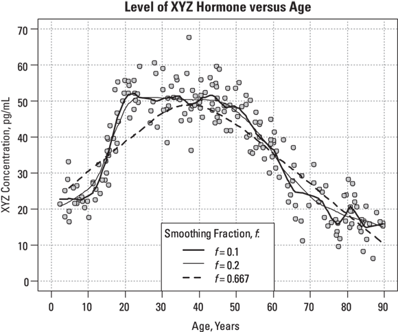
R’s LOWESS program allows you adjust the stiffness of the fitted curve by specifying a smoothing fraction, called f, which is a number between 0 and 1. Figure 19-12 shows what the smoothed curve looks like using three different smoothing fractions.
© John Wiley & Sons, Inc.
FIGURE 19-12: You can adjust the smoothness of the fitted curve by adjusting the smoothing fraction.
Looking at Figure 19-12, you can observe the following:
- Setting
 produces a rather stiff curve that rises steadily between ages 2 and 40, and then declines steadily after that (see dashed line). The value 0.667 represents 2/3, which is what R uses as the default value of the f parameter if you don’t specify it. This curve misses important features of the data, like the low pre-puberty hormone levels, the flat plateau during child-bearing years, and the slowing down of the yearly decrease above age 65. You can say that this curve shows excessive bias, systematically departing from observed values in various places along its length.
 - Setting
 , which is at a lower extreme, produces a very jittery curve with a lot of up-and-down wiggles that can’t possibly relate to actual ages, but instead reflect random fluctuations in the data (see dark, solid line). You can say that this curve shows excessive variance, with too many random fluctuations along its length.
 - Setting
 produces a curve that’s stiff enough not to have random wiggles (see medium, solid line). Yet, the curve is flexible enough to show that hormone levels are fairly low until age 10, reach their peak at age 20, stay fairly level until age 50, and then decline, with the rate of decline slowing down after age 70. This curve appears to strike a good balance, with low bias and low variance.
Whenever you do LOWESS regression, you have to explore different smoothing fractions to find the sweet spot that gives the best tradeoff between bias and variance. You are trying to display real features of the curve while smoothing out the random noise. When used properly, LOWESS regression can be helpful as a way of gleaning insight from noisy data.